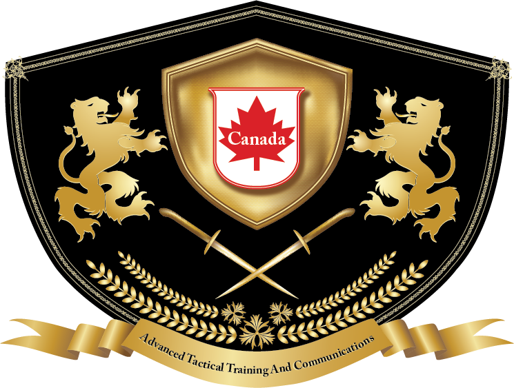
Why the Logo?
Logo's usually have some meaning and representation. Ours was designed to reflect our representation of what we stand for and our honour behind it.
Here is a short description of each portion.
This logo was created as an ancient heraldry emphasizing its noble cause. Knights of the past always served a noble king or a nobleman.
-
To distinguish themselves from others, they had to have unique heraldry.The foundation of this logo is a knight’s shield symbolizing the essence of this business: training for protection.
-
Two lions mean power and nobility. The lion denotes an aristocratic, powerful, and wise leader. Two lions imply a team of leaders.Lions proudly present a shield showing power and support.
-
Crossed swords signify military training.
-
The wreath of leaves and flowers brings a deep meaning showing that this business works to bring peace and prosperity to the world.
-
A ceremonial banner on the bottom of the logo carries the full name of the company.
-
Black and gold colours represent manly colours, the military, and nobility.
-
The white and red banner identifies it as a Canadian enterprise.
All the symbols together embody a very serious, powerful, and dignified company whose purpose is to protect and to create peace.